

2026-07-16
Vol.29
Art Director and Graphic Designer
Seri Tanaka(part 1)
-
The Birth of OSAJI Kyoto
-
Deconstructing a Kanji
-
Design as Adding Another Chapter
-
Avant-Garde and Playfulness
In April 2026, the cosmetics brand OSAJI opened its global flagship store, OSAJI Kyoto(*1). Set within a former sake brewery dating back 245 years, at the heart of the space is a new logo — one whose meaning does not reveal itself at first glance. The logo was designed by Seri Tanaka, an emerging figure known for her work in corporate identity, branding, and artwork. Why did Masakazu Shigeta, the founder of OSAJI, entrust her with the crucial task of creating the flagship store’s visual identity? Through their conversation, they explore an approach to making things that leave a lasting impression — one that could never emerge from efficient requirements documents or technical specifications. Their dialogue dissolves the boundaries between business and creativity, revealing the essence of collaboration for a new era.
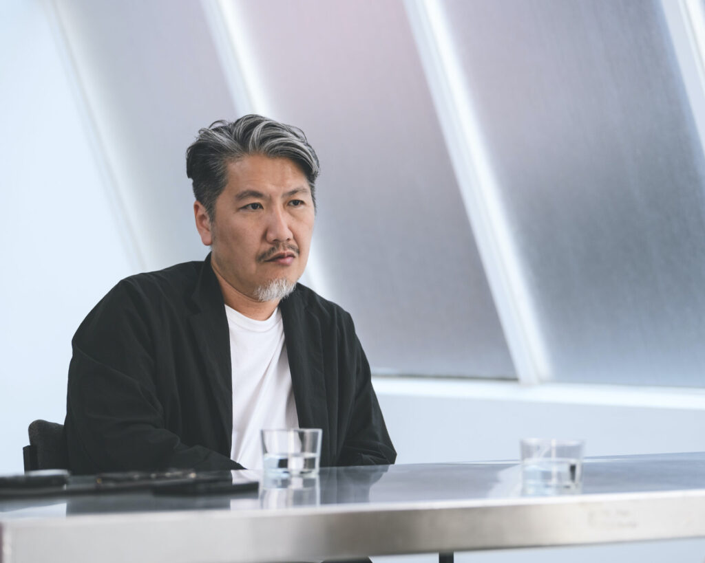
“I found myself asking what role we should play — one that would be distinct from the now-familiar trend of renovating traditional Kyoto townhouses into shops.” (Shigeta)
——On April 25, 2026, OSAJI opened OSAJI Kyoto, the brand’s first global flagship store. For this project, Mr. Shigeta reached out to Ms. Tanaka to create a new logo distinct from OSAJI’s existing visual identity, and that’s how your collaboration began.
Masakazu Shigeta: That’s right. Although I had known of her for some time, we had never been in direct contact. We had already decided to ask Mr. Shuzo Okabe, who also appeared in Idealism Vol. 10, to design the interior, but we hadn’t yet decided who should handle the artwork. After discussing potential collaborators with the project manager leading the store launch, we both felt Ms. Tanaka would be the perfect fit, so I reached out to her.
——I understand that when you approached her, you asked for “an authentic design that could carry us into the next era — something neither predictable nor driven by nostalgia.”

Shigeta: The building itself already had tremendous potential. It was originally a sake brewery, and it has stood there for 245 years. I felt that even placing a simple logo in a clean sans-serif font would probably look compelling in that setting. But that alone wouldn’t answer the question of what we should add to a building with such a long history. Nor did I want to simply follow the now-familiar trend of renovating traditional Kyoto townhouses into shops. I found myself asking what our role should really be.
At that point, I remembered a book titled Business Zen Nyuumon (Introduction to Business Zen) written by Daiko Matsuyama, the vice abbot of Taizo-in, a sub-temple of Myoshinji Temple in Kyoto. Taizo-in is home to a remarkable set of historic fusuma paintings, widely regarded as important works of art. But Matsuyama believes, “Anything with physical form inevitably decays, and if we focus too much on preserving it, it will eventually fade away anyway. Someone has to create what comes next here.”
With that in mind, he launched a project in which he invited young painters fresh out of graduate school to create new sets of those paintings while undergoing training at Taizo-in. There are discussions about how best to preserve what has been handed down through history, but I found it incredibly compelling that he first accepted the fact that these works would decay one day, and then concluded that repainting them now was precisely what would allow them to endure into a much more distant future.
That idea made me realize that our role wasn’t simply to adapt everything to the character of the existing building. What matters is making this place meaningful to future generations as well. OSAJI has existed for less than 10 years, while this building has stood for 245. At the same time, we’re building OSAJI with the hope that it will still exist a hundred years from now. Taking all of that into account, I spoke with her very directly about what kind of mark we should leave here today.
——Hearing the theme of “creating an authentic design that could be handed over to the future,” what was your honest reaction, Ms. Tanaka?
Seri Tanaka: Kyoto is full of buildings that have been carefully preserved for hundreds, even thousands of years. In that context, my first question was what direction this project was meant to take. Then, Mr. Shigeta told me he wanted something different from the solemn, formal atmosphere traditionally associated with Kyoto — a design that stepped slightly outside those expectations. Hearing that, something clicked inside me, and I remember feeling a real surge of excitement.
One thing he said at the time left a particularly strong impression on me. He said, “Japan isn’t defined by historic Kyoto alone. Chaotic culture and subculture are just as much a part of Japan, and there is even a thread connecting Noh and Vocaloid.” That idea genuinely caught me by surprise — although they belong to completely different eras, both share the same underlying ideas: presenting something with the face concealed, and leaving room for the viewer’s imagination. After hearing that, the direction became clear to me.

“OSAJI Kyoto isn’t a place that is complete the moment it opens — it’s a place that continues to grow over time. Thinking about it that way, I felt the logo should be something that takes a little time for people to understand.” (Tanaka)
——Ms. Tanaka, I understand you often jot down keywords, then develop your ideas from them. Were words like Noh or Vocaloid the starting points for this project?
Tanaka: Yes, they were. As I wrote those words down, I wasn’t trying to create something completely new. Instead, I was thinking about how to reinterpret something that already exists — by changing the point of view, or by asking which structural element I could remove. Those are the kinds of questions that help my ideas grow. Also, I often think about where to place the jumping-off point. Knowing that everyone shares the same perspective and stands on the same platform, the real question is where to place that jumping-off point. That’s where my ideas begin to develop.
For this project, that jumping-off point was the idea of “reinterpreting something that is already there.” As a brand, OSAJI already has a fascinating story. The brand name itself derives from the word Osaji, the title given to the head doctors who served the Daimyo and Shogun during the Edo period. Since that story itself is already so distinctive, I decided to deconstruct the kanji 匙 (Saji).
At the same time, I realized that what OSAJI is trying to do in Kyoto through blending reflects the very structure of kanji. Just as the character 明 (bright) is created by combining 日 (sun) and 月 (moon), the character 匙 (Saji) is also made up of several component elements. That itself is a kind of blending, which is also the concept of OSAJI. I started by asking what might emerge if I took the character apart, and that process eventually led to the design.
——So, the very first idea evolved quite directly into the final design?
Tanaka: Yes, you can say so. I tend to develop the ideas by starting with the underlying structure rather than the form itself. This time, as I deconstructed the kanji, it naturally evolved into the logo.
The kanji 匙 (Saji) is composed of 日 (sun), a distorted form of 正 (rightness), and 匕 (spoon). Together, these elements perfectly express the purpose of OSAJI Kyoto — a place that helps restore balance to the body in everyday life. Moreover, in Japanese, prefixing words with “O” is a way to express respect for people and objects. To emphasize it, the “O” is set in a modern Gothic font, while the elements derived from the character 匙 (Saji) are rendered in a brush-style script. That is also part of what makes the design interesting — something that could only emerge from working with a digital font instead of original calligraphy.
——You once said that designing a logo is like giving a brand or product its own character. What kind of character did you try to give OSAJI Kyoto this time?

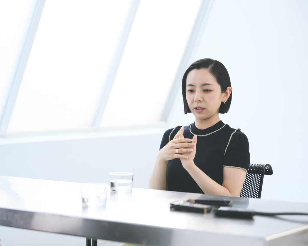
Tanaka: As a consumer myself, I have always associated OSAJI and its products with a sense of gentleness. That was the image of the finished products, but as I spoke with Mr. Shigeta and the project team, I began to feel that this place would be something closer to the stage before the product itself — a place for experimentation. I came to see OSAJI Kyoto as something like the brand’s workshop, or even the place where the way of life that gives rise to the brand takes shape.
Rather than being complete the moment it opens, it’s a place that continues to grow over time. Thinking about it that way, I felt it would be better for the logo and this place to have a character that takes a little time for people to understand, rather than one that feels immediately complete.
——Mr. Shigeta, what was your impression when you saw the logo?
Shigeta: To be honest, I found it difficult to understand at first. (laughs) But at the same time, I felt that was precisely what made it important. If it had been easy to understand immediately, I don’t think it would have been right. In that sense, I thought it was an excellent design.
Tanaka: That’s exactly what he said when I first proposed it. “It makes me uneasy because I’m not used to seeing something like this — but that’s exactly why it’s good.” Hearing that, I was reminded that someone truly committed to excellence is simply different.
Shigeta: I’m not sure how to put it, but the more I see the logo, the more I like it. In Japan’s design and music circles, we’d call that a surume-kei design — like dried squid, it reveals more flavor the more you chew on it. That’s exactly the kind of design I wanted. I don’t know why, but the things we end up loving often begin as something that feels slightly unfamiliar or out of place. That initial sense of discomfort gradually turns into affection — and that’s what allows you to stay with it for a long time.
To me, that’s the very nature of beauty. In other words, the concept of beauty itself has those characteristics. When we think about beauty, is a perfectly proportioned face really the most beautiful? Sometimes it’s the slight imperfection or touch of innocence that stays with us. Perhaps that’s what beauty really is.
So, proposing something like that can leave a new mark on something that has endured for 245 years, and that’s precisely how you carry something forward into the future. Honestly, I’ve come to genuinely love the OSAJI Kyoto logo. Whenever I see the noren (the Japanese curtain on the entrance of a shop) swaying in the breeze, I can’t help saying, “I love it!” These days, I find myself thinking that every time I walk beneath it.
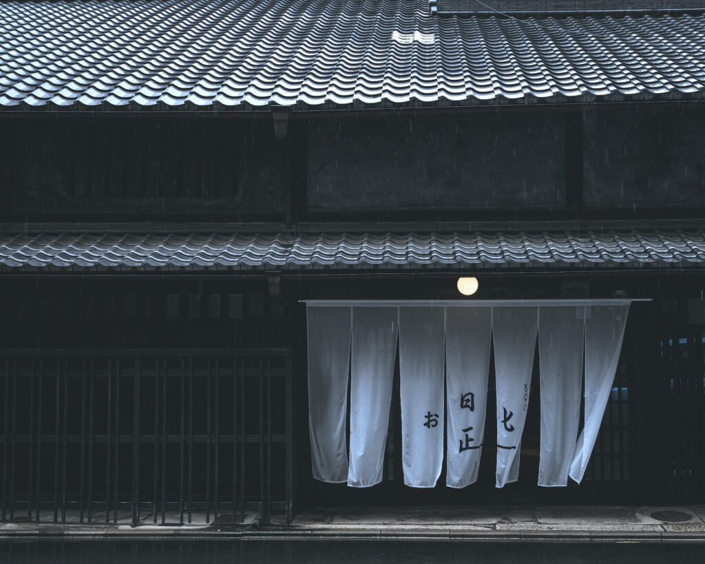
“When I’m working with a place that has existed for nearly 250 years, I inevitably find myself asking whether what I create today might still be here another 250 years from now.” (Tanaka)
——Ms. Tanaka, you’ve also worked on projects for Senkin, a sake brewery in Tochigi Prefecture with more than 200 years of history, as well as Dazaifu Tenmangu Shrine, whose history spans more than 1,100 years. When you engage with places or institutions that carry such long histories, how does that change your sense of time and your yardstick? And in the case of OSAJI Kyoto, with its 245-year-old building, how did you think about the texture of time?
Tanaka: Whether I’m designing something or simply visiting an exhibition, I love that feeling of my sense of time and perspective stretching and shrinking. When I’m working with a place that has existed for nearly 250 years, I inevitably find myself asking whether what I create today might still be here another 250 years from now. As I imagine the past, I also find myself anchored in the present — and from that point, my sense of time stretches far into both the past and the future. I find that process deeply fascinating.
Next year, Dazaifu Tenmangu Shrine will hold the Grand Festival commemorating the 1,125th Anniversary of the Enshrinement of Sugawara no Michizane, and I had the opportunity to design the logo. When you think about its extraordinary history spanning 1,125 years, the question naturally becomes: What kind of mark should we leave today so that it can continue for the next 1,125 years? Seen that way, what I need to do actually becomes quite simple. My own existence is tiny — almost insignificant — so perhaps all I can do is leave a small mark. I found myself thinking in much the same way while working on OSAJI Kyoto. To me, design is ultimately about passing the baton from one generation to the next. Rather than inventing something new, what interests me most is contributing to something that already exists — almost like adding another chapter to an ongoing story.
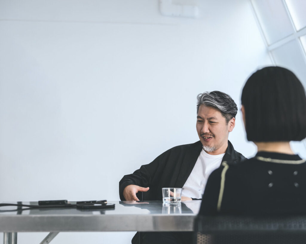
“We can’t ignore ideas like mindful living or well-being because they’re important, after all. But if that’s all we pursue, we eventually get tired of it. That’s why it’s so important to step slightly outside those expectations.” (Shigeta)
Shigeta: To be honest, when we began creating the Kyoto store, I had two hidden themes in mind — punk and avant-garde. In other words, I didn’t want it to become too well-behaved.
Take Jomon pottery, for example. Looking at it today, it feels incredibly avant-garde. Or think about the kimonos Oda Nobunaga, the famous Japanese warlord, wore; they were remarkably punk. But after the emergence of Sen no Rikyu, it seems a certain idea of “Japanese style” became established and refined. I really appreciate that aesthetic, but if that’s all there is, people eventually become exhausted. It’s as if you’re expected to be well-behaved all the time.
I think the popularity of so-called “guilty pleasure” in food reflects the same thing. We can’t ignore ideas like mindful living or well-being because they’re important, after all. But if that’s all we pursue, we eventually get tired of it. That’s why it’s so important to step slightly outside those expectations.
Even the history of sake has that kind of spirit. Religious rituals involving sake were originally quite unconventional. There was kuchikami-zake, or mouth-chewed sake, and festivals where people gathered to drink together. Getting drunk itself was understood as a kind of divine force.
I’d like our products to have that same quality. Not just refined and elegant all the time, but occasionally willing to say, “Let’s have a little fun,” and encourage people to loosen up.
——That sense of play and stepping outside can be seen as a kind of critique of today’s well-behaved market. How does that philosophy translate into your products and the way you think about skincare?

Shigeta: I’ve always felt that I don’t want to tell someone who isn’t particularly detail-oriented that they need to follow a meticulous four-step skincare routine. And somehow, those are often the very people who have beautiful skin with the simplest skincare. (laughs)
It’s not exactly the placebo effect, but I think there’s an instinctive strength in believing, “This is enough,” and feeling confident in your own choices — an openness that isn’t bound by rigid rules. I want OSAJI Kyoto and our products to carry that strength and ease — the confidence to let go of rigid ideas of what’s “right” and trust your own instincts. That was another hidden theme I had in mind. I truly feel that her design captured that invisible atmosphere beautifully.
Tanaka: I understood the idea of avant-garde as something similar to playfulness. Another keyword that came up several times was everyday life. He also said that he didn’t want Kyoto to be seen too much as a symbol of something extraordinary.
Traditional culture, after all, wasn’t created entirely through solemn or exceptional acts. More often, it grew out of small ideas rooted in everyday life. So, rather than trying to make the design feel special, I wanted it to feel more approachable.
Take Edokomon, for example. From a distance, the fabric appears to be plain gray, but up close it reveals remarkably intricate patterns. It’s said that this style was born out of resistance to the Edo shogunate’s sumptuary laws, which restricted ordinary people from wearing flashy clothing. The fabric is full of intricate patterns, yet from a distance, one could still insist, “It’s just a gray kimono.” I find it fascinating that avant-garde ideas from these small acts of resistance eventually became part of Japanese culture. That made me wonder what the equivalent might be today.
——Listening to the two of you, I was just reminded of graphic designer Masayoshi Nakajo(*2)’s words: “Design shouldn’t strive for well-behaved correctness.” I feel there’s something of his spirit in your work as well, Ms. Tanaka.
Tanaka: I’m really glad to hear that. Mr. Nakajo is one of my favorite designers in Japan. Whenever I look at his work, I feel as though he’s telling me, “Be more playful with design. You can be sillier. You can have more humor.” I want to create something that makes people let out a little laugh the moment they see it. But there’s still a part of me that wants my work to look cool, and that part often gets in the way. It’s something I find myself wrestling with every day.
(to be continued in the second part)
Note:
*1_OSAJI Kyoto
Opened in April 2026, OSAJI Kyoto is the brand’s first global flagship store. Housed in a 245-year-old former sake brewery, the building is also known for Momonoi, the celebrated natural spring that still wells up on the site and has long been used in sake brewing. While embracing the site’s history, the space deliberately departs from conventional expectations, presenting itself as a place for experimentation that carries the baton to the next generation. The architectural design was led by Shuzo Okabe, while the new logo created by Seri Tanaka serves as the store’s symbol, appearing on the noren curtains as well as on OSAJI Kyoto’s original products.
*2_Masayoshi Nakajo
Masayoshi Nakajo was one of the leading figures in postwar Japanese graphic design. For four decades, he served as art director of Hanatsubaki, Shiseido’s corporate cultural magazine, and created numerous iconic works, including the packaging design for Shiseido Parlor. Unbounded by conventional rules or ideals of what was considered “correct,” his distinctive aesthetic combined bold humor and a refreshing sense of dissonance. Even after his passing in 2021, his work continues to inspire generations of creators.
Profile
-
Seri Tanaka
Born in Ibaraki Prefecture in 1987, Seri Tanaka is an art director and graphic designer. Instead of treating design as a mere visual symbol, she explores the underlying aesthetic values and cultural context that a place or brand has cultivated. Her signature approach is to reinterpret existing assets and add another chapter to them through a flexible, structurally driven design process. Her major works include logo designs for the long-established sake brewery Senkin, Koumi-machi Kougen Museum of Art, and AMBIENT KYOTO. She is also known for her graphic design work for the alternative rock band Hitsujibungaku. In addition to her commercial practice, she produces personal photographic works exploring chance and serendipity. She has received numerous awards, including the JAGDA New Designer Award, as well as honors from Cannes Lions and the NY ADC.
https://seritanaka.com -
Masakazu Shigeta
Shigeta began his career in a technical role in the music industry before becoming a cosmetics developer in 2001. Beginning in 2004, he led the development of various cosmetics brands within the healthcare division of Nitto Denka Kogyo Co., Ltd., a metal surface treatment company founded by his great-grandfather. In 2017, he founded OSAJI, a skincare lifestyle brand, and became its brand director. In 2021, as a new store under the OSAJI brand, he launched kako, a specialty shop dedicated to home fragrance blending, and in 2022, he opened OSAJI’s first restaurant, enso. In 2023, leveraging Nitto Denka Kogyo’s technical expertise, he launched HEGE, a tableware brand, and became CEO of OSAJI Inc. in October of the same year. In 2026, as a personal project, he opened Shirakabaso, a private rental lodging facility in Sarugakyo Onsen, Gunma Prefecture, and launched OSAJI Kyoto, the brand’s global concept store in Kyoto’s Gosho Minami district. In the same year, he launched soca, a fragrance brand rooted in Japan’s unique aesthetic sensibilities. He has published books on beauty and regularly holds cooking classes and events focusing on food as the foundation of beauty.
Publications
Taberu Biyou (Eating for Beauty) (SHUFU TO SEIKATSU SHA, 2024)
42-Sai ni Nattara Yameru Biyou, Hajimeru Biyou (Beauty Routines to Quit and Start at 42) (Takarajimasha, 2022)
-
Photographs:Eisuke Komatsubara
-
Text:Masahiro Kamijo

NEWS LETTER
理想論 最新記事の
更新情報をお届けします
ご登録はこちら
ご登録はこちら
メールアドレス
ご登録ありがとうございます。
ご登録確認メールをお送りいたします。